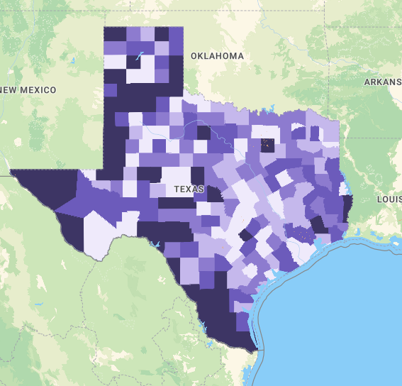
Report Type: Maps

NEW MAP: What your neighborhood says about your life expectancy in Texas

New numbers show there can be more than a 20-year difference in how long Texans live in one neighborhood compared to another, even though they may only be a few miles apart. That’s just one of the findings from an Episcopal Health Foundation analysis of a new, interactive mapping tool that shows life expectancy rates for neighborhoods across Texas.

Read More »

EHF’s Texas COVID-19 Maps Dashboard

EHF has developed updated Texas COVID-19 maps at the county level that show the number of cases, social vulnerability, unemployment rate, Federal Coronavirus Relief Funds allocation, and availability of philanthropic COVID relief funds. These maps are updated weekly and aim to inform discussion on programs, services and funding to address challenges associated with pandemic.

Read More »